Linux is used by Hollywood extensively to create movies.


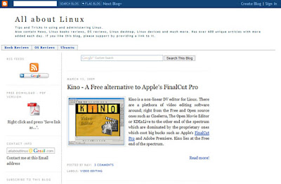
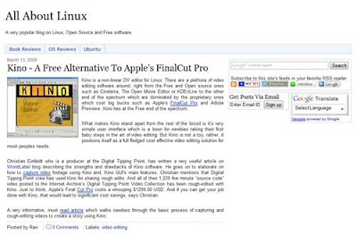
A few features worth noting of this new design
- Stress has been given to minimalism. There are very few images.This translates to faster loading of the web page. I am a sucker for minimalist web designs with plenty of white space.
- The design is devoid of tables. In fact, the number of tables you will find on this site (design wise) are zilch ... Nada.
- The site uses Google Custom Search which helps a visitor to this blog find what he is looking for very fast. And the search is prominently displayed at the upper right corner of the site.

Try it out, it is really good. You can search through over a 1000 articles on this site. - Non-English speaking visitors to this site can read the articles in their language of choice through the Google Translate widget displayed on the right hand side.

- I have even incorporated some of the best SEO practices into the design. Though it is early to say what effect (positive or negative) these changes will have on the site traffic.
- The "Do you Know?" box - an optional feature, allows me to prominently displays some data and links not related to the parent post.
- All the javascript (or most of it) has been moved to the bottom of the page as recommended by Google's webmaster guidelines.
- The site has a functional footer where some text is actually embedded.
Can you share this blogger theme with the rest of us?
Well, I believe a unique design helps a site maintain its identity. Having said this, now that I have understood the process of designing a website, I might create further blogger designs which I promise to provide as a free download. Of course, anybody with some knowledge in CSS and HTML can easily figure out what I have accomplished here.
Please tell me what you like and what you don't about the new design of this site. All your opinions (critical or otherwise) are most welcome.
No comments:
Post a Comment